Scroll down for process! ;)


Peace Tea
Design and Animation by Marly Koven
Sound Design by Matheo Quevedo
Scotch Tape

Design, Animation, and Sound by Marly Koven
Kit Kat

Design and Animation by Marly Koven
Sound Design by Jacob DeRouen
Process
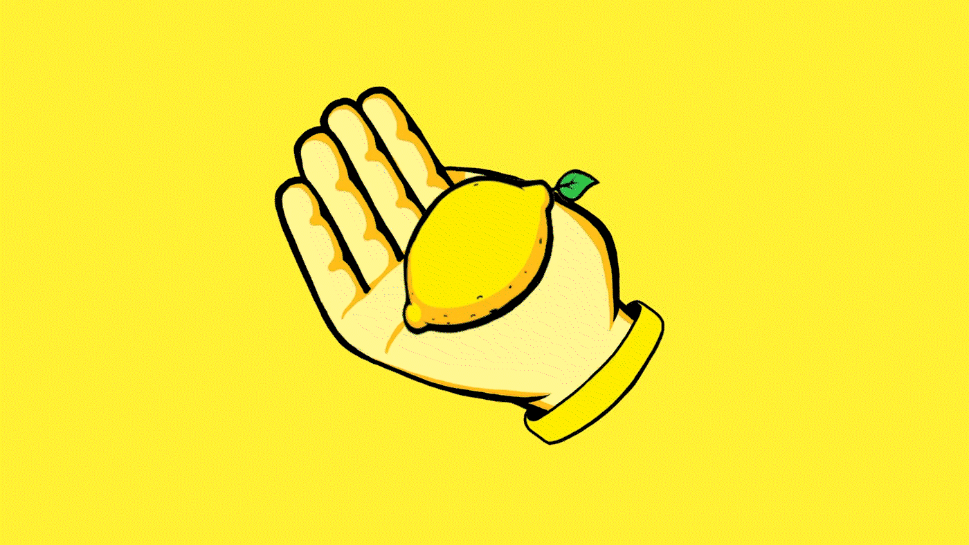
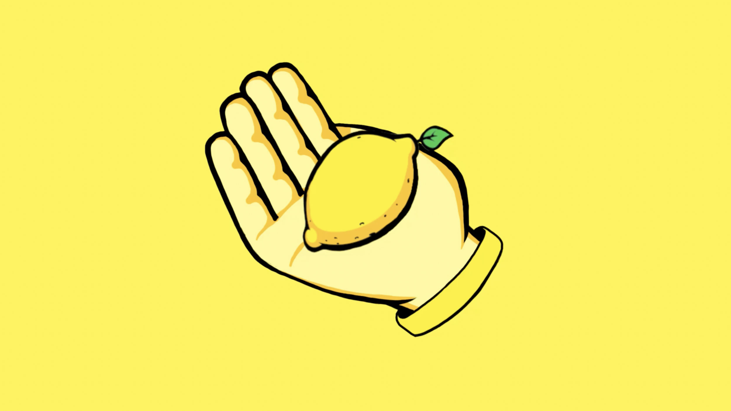
Peace Tea
Research
While researching Peace Tea’s brand, I found their brand refresh from 2017 in which they created a new logo. Their main objectives were to better communicate “refreshing tea flavor,” distinguish between flavors, reinforce their brand core values (Peace, Love, and Happiness), appeal to millennials & Gen Z, and establish relevancy against their main competitor, Arizona Tea.
Concept
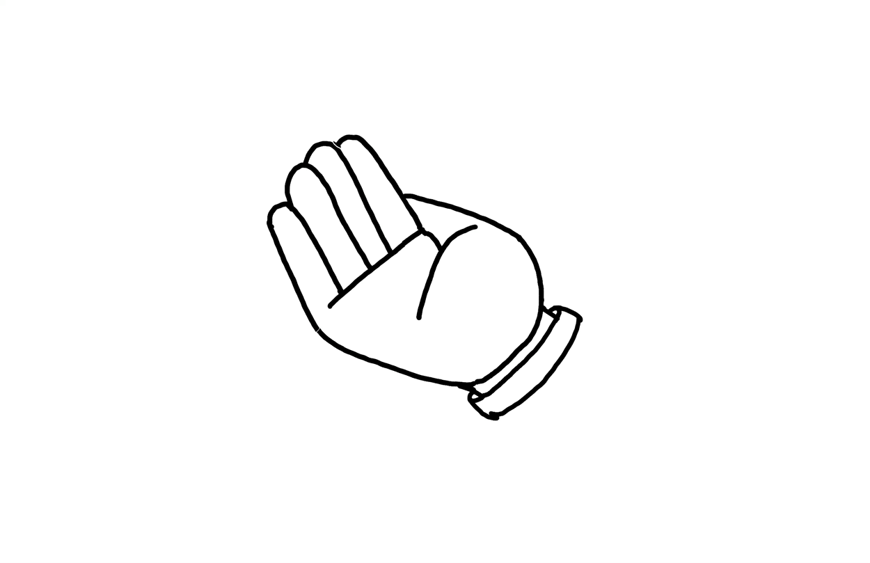
I focused on accomplishing Peace Tea’s main objectives from their recent brand refresh to create a fun, illustrative logo resolve that would communicate “refreshing tea flavor” and appeal to a younger audience. My idea was to use the hand from the logo to hold each flavor and then transition to the peace sign.
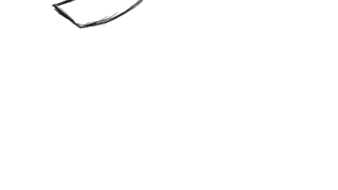
Storyboard
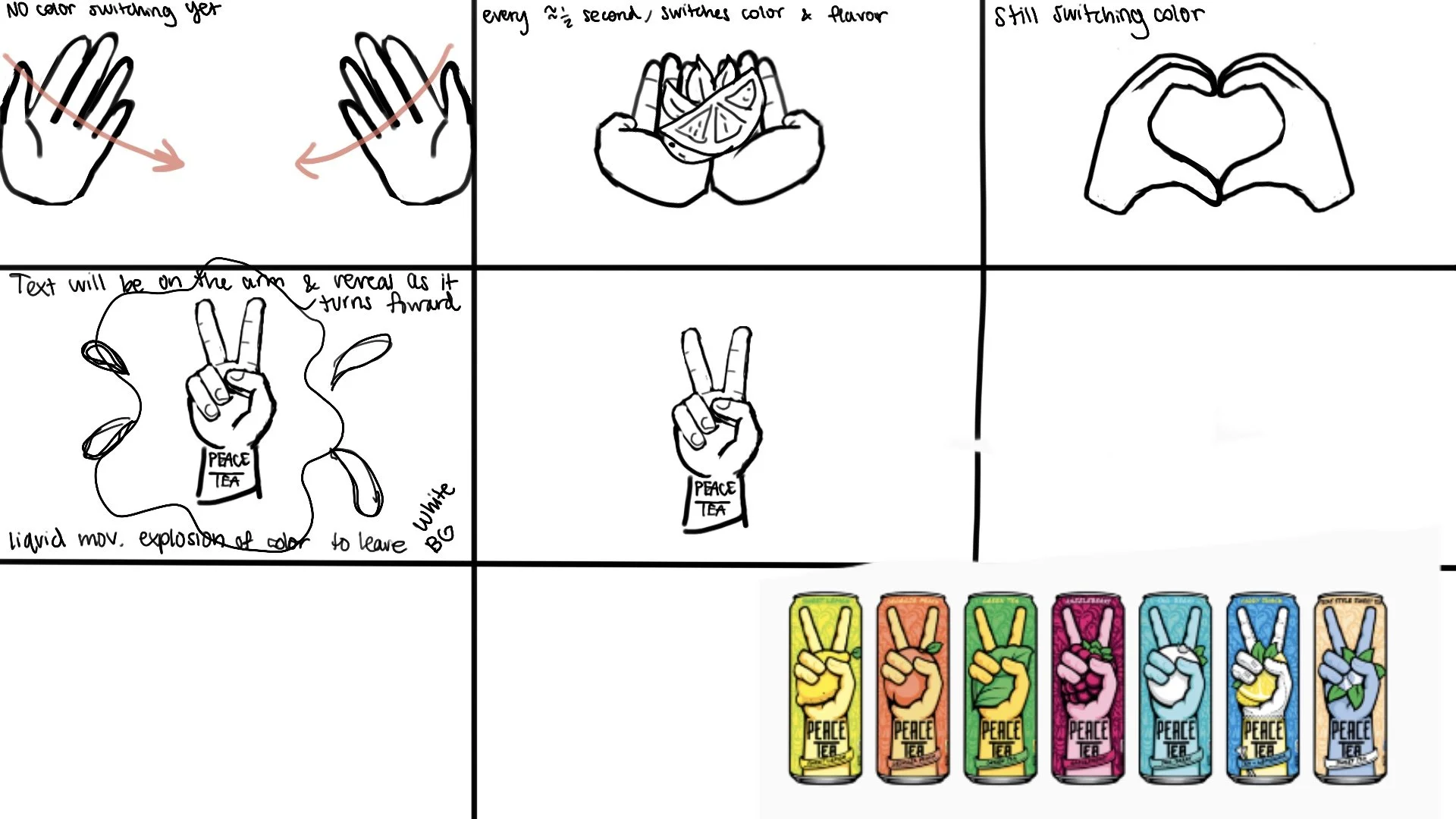
At first, my storyboard involved two hands:
After some thought and critiques in class, I realized I could make this logo resolve much more powerful by making it more simple. The second hand and transition to a heart were taken away to leave one hand and one fluid motion.
Animation
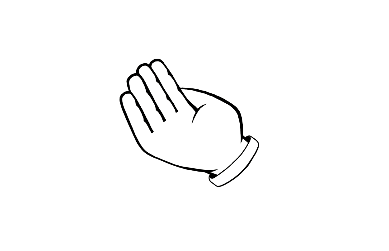
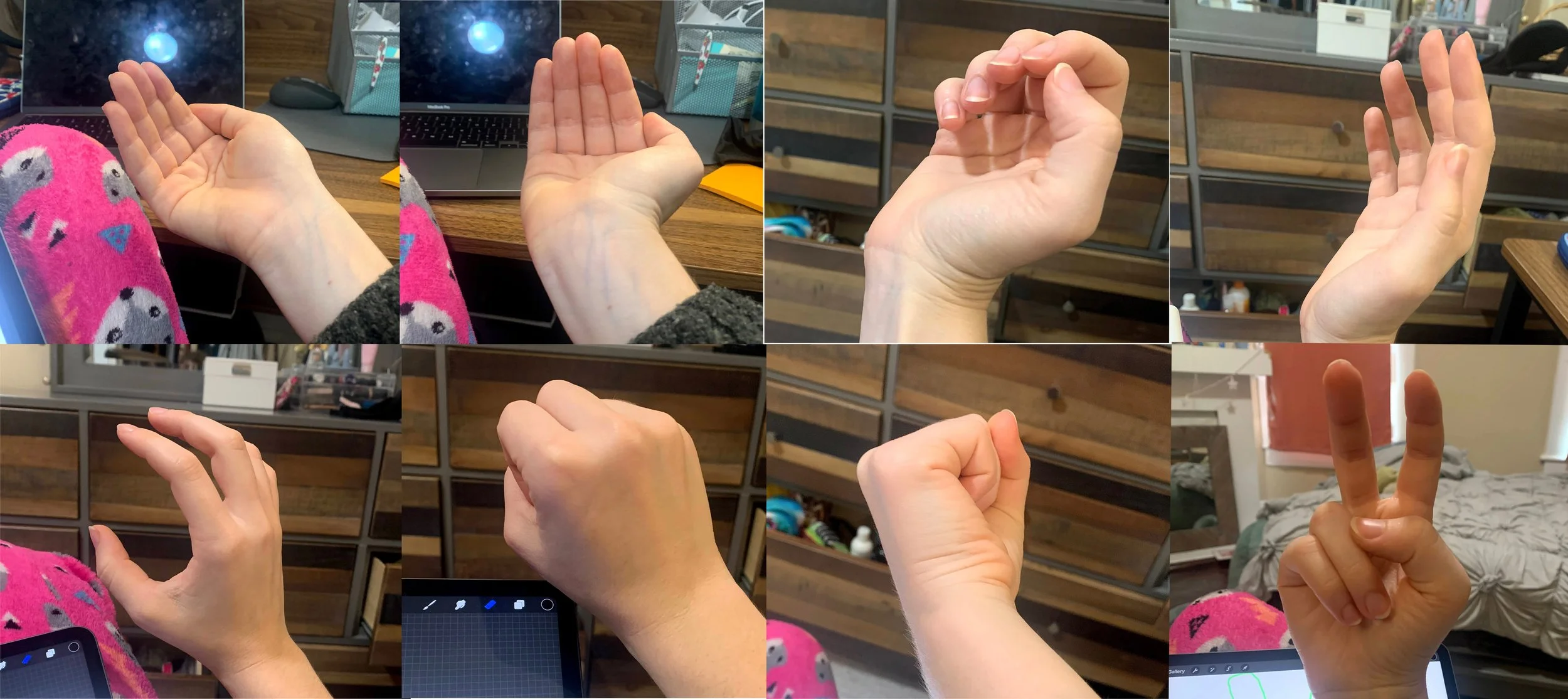
I first created a rough animation in Procreate using photo references. I decided not to rotoscope because: (1) I wanted the movement to be smooth, exaggerated, and “cartoon-y” and (2) my wrist does not turn 360 degrees.
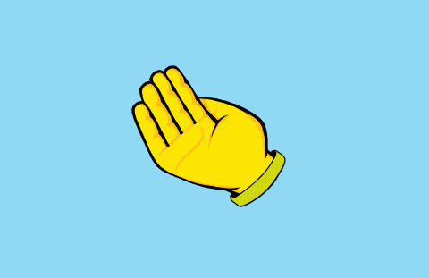
Next, I cleaned up the line art to match the style of the already existing logo animation so that the transition into the logo would be seamless. I then added color in Procreate. Another step was to create the colorful liquid motion explosion.
All of the color-changing and adding of the flavors and explosion was done and combined in After Effects.
Scotch
Concept
The idea for this came almost as soon as I saw Scotch’s logo. Scotch is all about sticking things together so how perfect would it be to stick its own logo together?
Sound Design
I recorded myself playing around with tape to use for the sound design of this logo resolve.
Animation
Storyboard

I started with this animation and then realized it wouldn’t cover “sco” on its way down.

Tape with more horizontal movement.
I used a small piece of paper as a reference for the shape of this cel animation. I then took that as a reference for a shape path animation in After Effects in order to make the lines crisper. The masking of the letters was also done in After Effects.
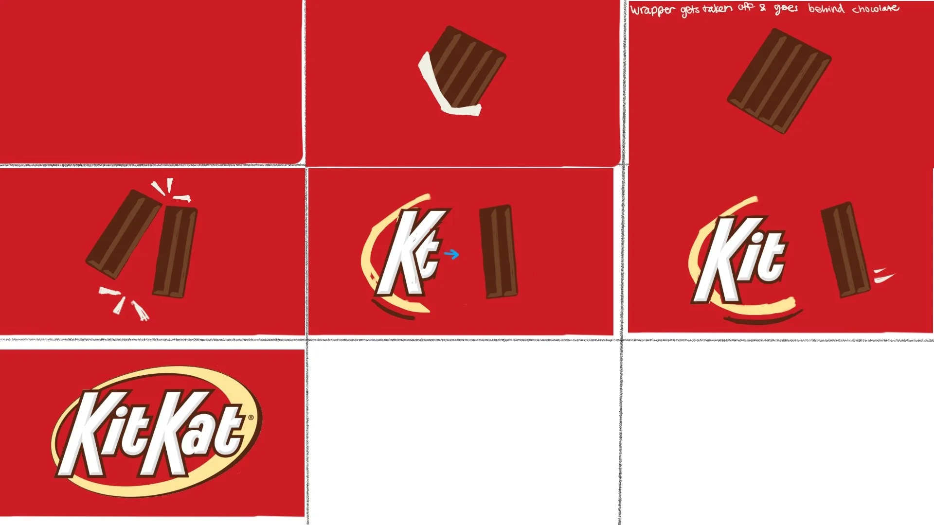
Kit Kat
Concept
This logo resolve was very sound-driven because I wanted to use the infamous Kit Kat Bar sound. The idea for this also came from looking at the logo itself and realizing that the 2 K’s kind of look like the chocolate bar after it’s been broken.