
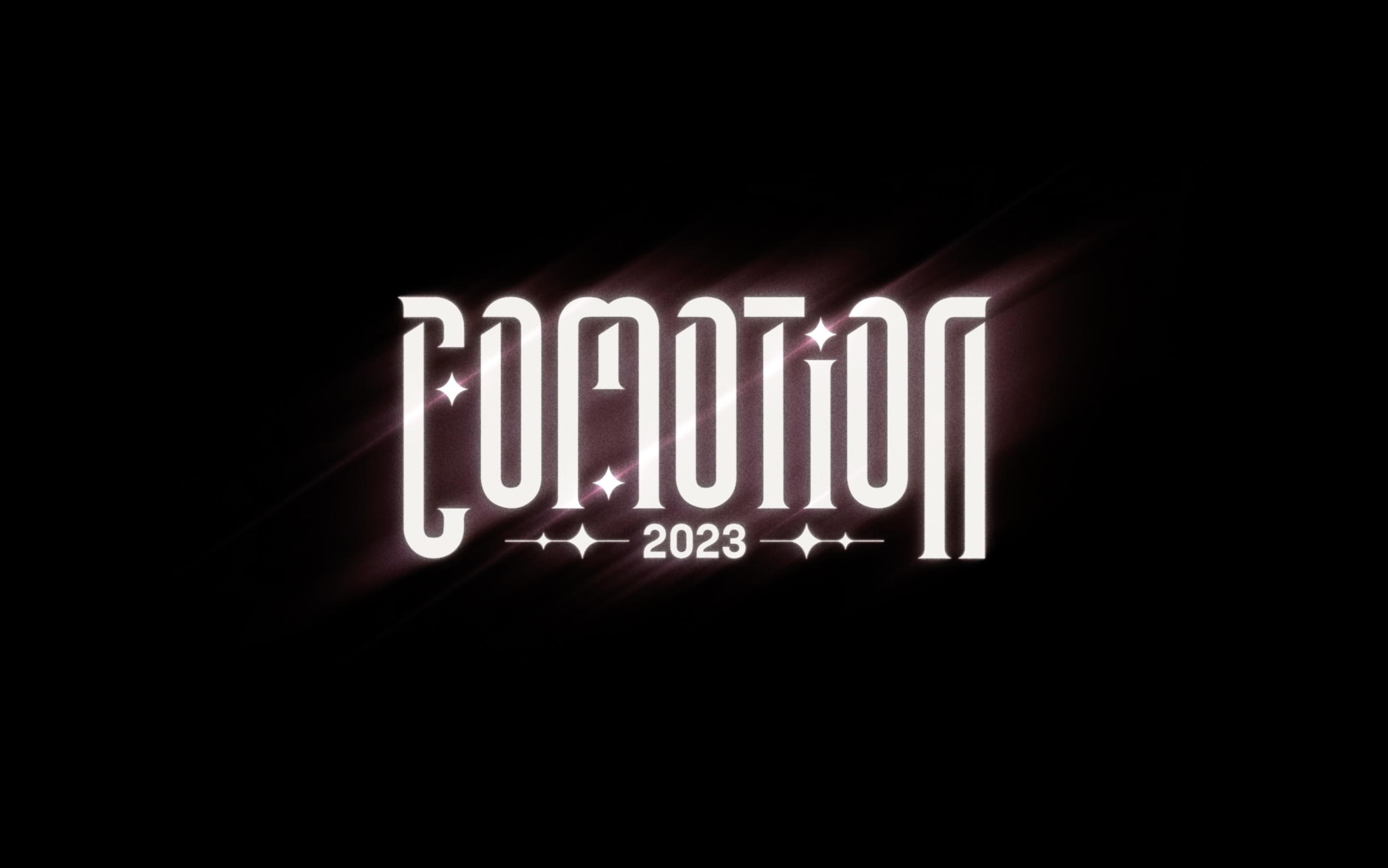
CoMotion 2023
Role: Art Director
CoMotion is a student-led motion graphics conference that brings together top industry professionals with Motion Media Design students at the Savannah College of Art and Design. This year’s brand identity celebrates SCAD’s talented students through the only medium connecting all types of motion design: light. The title sequence explores our relationship with light.
This year I had the incredible opportunity to be the Art Director of the branding team. I was able to help direct a group of almost 40 students in the animation, design, graphic design, experiential, web, documentation, and sound teams as well as help design and animate deliverables myself.
Process
Creating the Pitch
The CoMotion 2023 process for me started in early September 2022 when Aanvik and I joined forces to create a branding pitch for the branding competition. He already had a giant Miro board full of ideas and references. There were so many possibilities and places we could go with the pitch, so the next step was the hard part: narrowing it down. Over several weeks we kept being drawn to references that contained a lot of noise and blurs, filmic language, and nostalgia. We also both tended to lean towards designs that were simple and sophisticated in the way that they did not shy away from negative space.
We ended up coming up with the idea of using light, specifically how art and light have been connected throughout history, as a way to unify all of Motion Design. A large concern of ours was to make sure our diverse ambitions for the branding would still feel cohesive. One way we accomplished this was a very limited color palette.
And here’s the pitch!
After winning the competition, we selected the rest of the team and what had once just been a partnership, became a very large team effort. Before I go into more detail, check out this brief documentary that showcases the work of the entire branding team!
An important part of my role was ensuring that every aspect of what we created felt cohesive and on brand. When creating ideas and concepts, I’d think about how they can relate to light. Often, we’d use the behaviors of light such as refraction to guide the ideas. I also ensured cohesiveness through the feedback I gave. One of my big comments that I told many designers and graphic designers was to make things STUPID simple.
Title Sequence
The first step in creating the title sequence was compiling the storyboard. We were grateful that we obsessed over the title sequence during the pitch phase so that we could quickly start working with the designers.
This is a compilation of all the styleframes! The design team did a wonderful job.
Here’s a fun example of a frame’s process:
A design I created in the pitch phase before even selecting the colors.
The design finalized for the pitch.
Styleframe made by Yining Li
Logo Animation
One of my responsibilities was to animate the logo. The idea behind the animation was pretty simple — “light” reveals the logo which then glows and sparkles. I created this using After Effects. It is essentially a reveal using fractal noise (spiced up to have the edges revealing first) which then uses Colorama and a lot of glow effects and small optical flares.
An early motion test.
Inside After Effects.
Title Cards

These title cards were designed by the graphic design team and animated by the animation team (plus I animated three of them!) One of my favorite problem-solving moments was when I suggested using a blur effect to allow the text to appear on top of the designs. This solved the issue of busy visuals and text and created consistency in all the title cards’ motion behavior.
Loop version as seen in the title sequence and on the CoMotion website.
Instagram Grid
Here’s a compilation of all the instagram posts. These were designed and animated by the design team.
Graphic Design Print Deliverables


These are AR Postcards!

This was an incredible experience, unlike anything I’ve ever done before! I am so lucky to have done this work alongside such a talented team, they make me look good! Thank you to everyone who was on the team for trusting me and working so hard.
Creative Director: Aanvik Singh
Art Director: Marly Koven
Producers: Rachel Golla, Alexis Dow
Lead Animator: Desmond Du
Lead 3D Animator: Stephen Mok
Animators: Harshitha Suresh, Kyle Switzer, Isabelle K Winarto, Kaleb Sweeney, Cathy Lin, Meg Aki, Erica Kim, J.C. Petrofsky
Lead Designer: Tiffany Lo
Designers: Antara Ghosh, Jessica Liou, Alexis Wang, Tiffany Teddy, Peter Wang, Xinxun Liao, Yining Li
Lead Graphic Designer: Josie Glassman
Graphic Designers: Punasa (Bee) Sihsobhon, Meghna Shourie, Nicole Lin, Claire Lin, Sophia D’Alleva, Stephanie Sandoval
Lead Experiential: Samantha Woods
Experiential: Juan Pablo Silhy, Alyssa Mackersie, Meghan Romance
Web Developers: Amadeus Cameron, Isabelle Duffner
Composer: Miguel Concha
Lead Documentation: Libby Nett
Documentation: Caitlin Crooker, Savitri Trivedi
Special Thanks: MOMELove, SCAD Motion Media professors
